Programs is a simple CRM inside the FanThreeSixty fan data platform. Sales teams at sports organizations use it to manage their season ticket renewals and new business campaigns.
Programs accounts for about 40% of all pageviews, making it the most used FanThreeSixty product. I worked closely on this product from its inception in 2014 to where it is today.
How it started
I began my career as a functional writer, so my work initially consisted of capturing requirements and UX details in user stories and workflow diagrams.
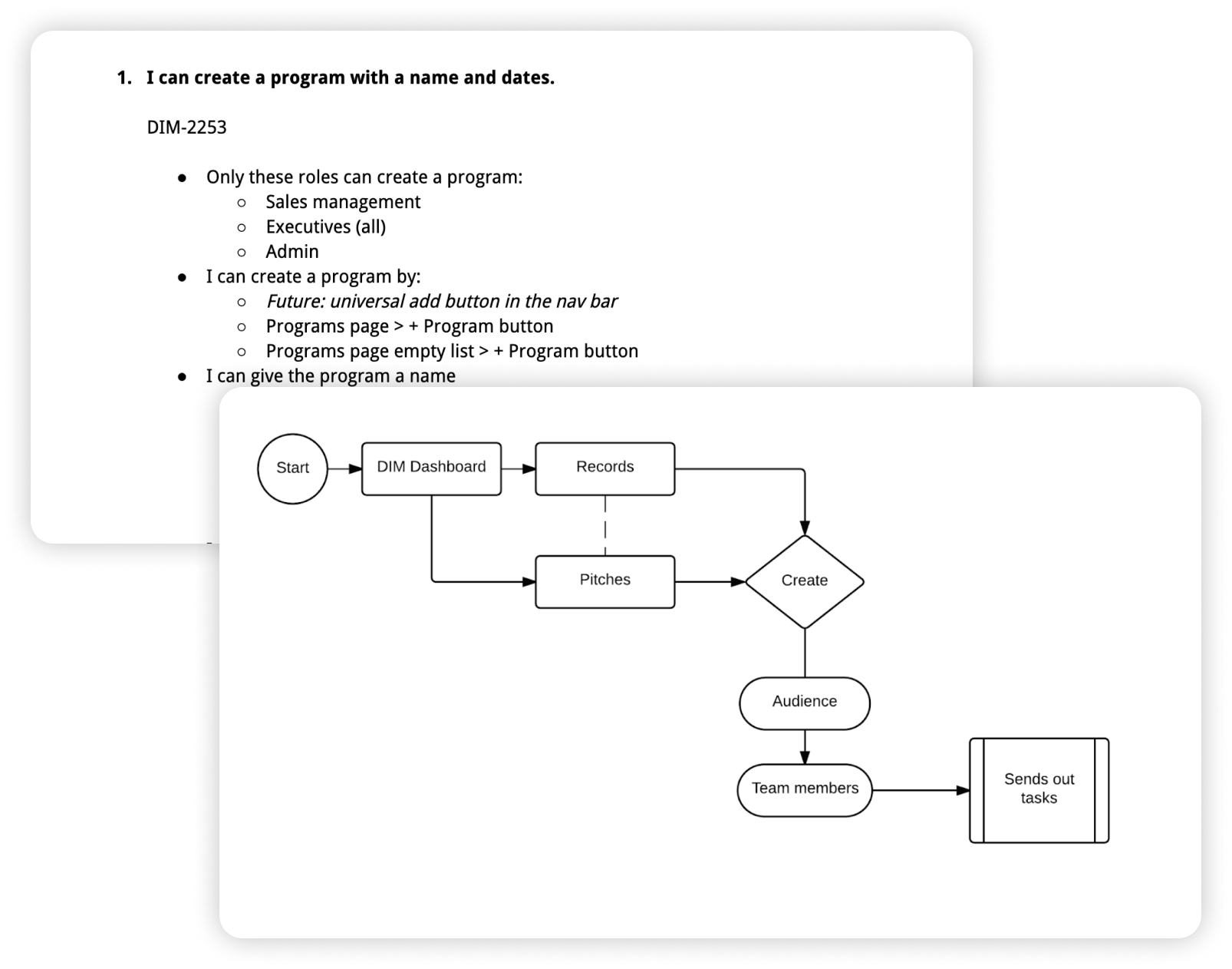 Artifacts from the first iteration of programs
Over the years, I worked on incremental design and UX enhancements and then got to concept and lead a complete redesign of the product.
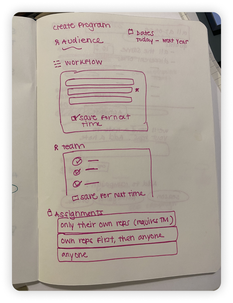 A sketch for a new version of the programs builder
Sales rep workflow
The fan list is where a sales rep spends most of their time. It consists of three sections: the list of fans to call, filters for the list and detailed info about the currently selected fan.
The original designs put the list of fans in the center of the page and gave it the most real estate. But after observing users and doing in-depth interviews, we learned that a rep is most often focused on having a conversation with one fan at a time.
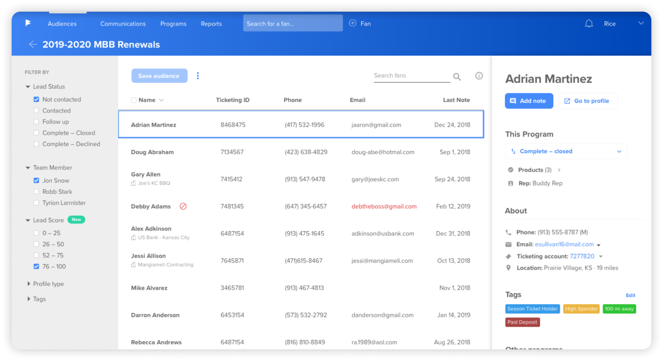 A program fan list circa 2019
We used this insight to reconfigure the list page so the single fan’s info took up more real estate on the page.
To get this done, I dug into the code, scrapped the old bootstrap scaffolding and building a better layout using CSS grid and flexbox.
 In 2020, we introduced the "big info panel"
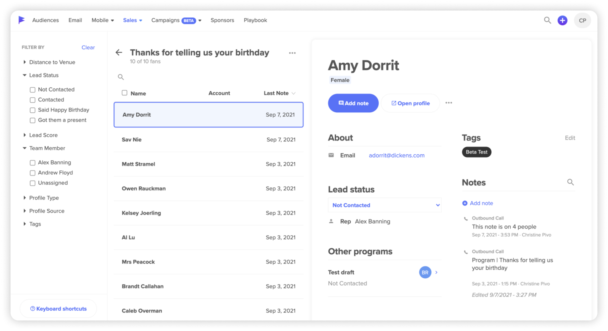
Eventually, time and resources allowed us to bring the full design evolution to life. We streamlined the workflow by moving the filters into a modal and adding white space. The user can hide the list and see a full-screen view of the single fan. We also added the current day’s touchpoint count to this page, since we learned that was a metric our reps used to keep track of in another tab.
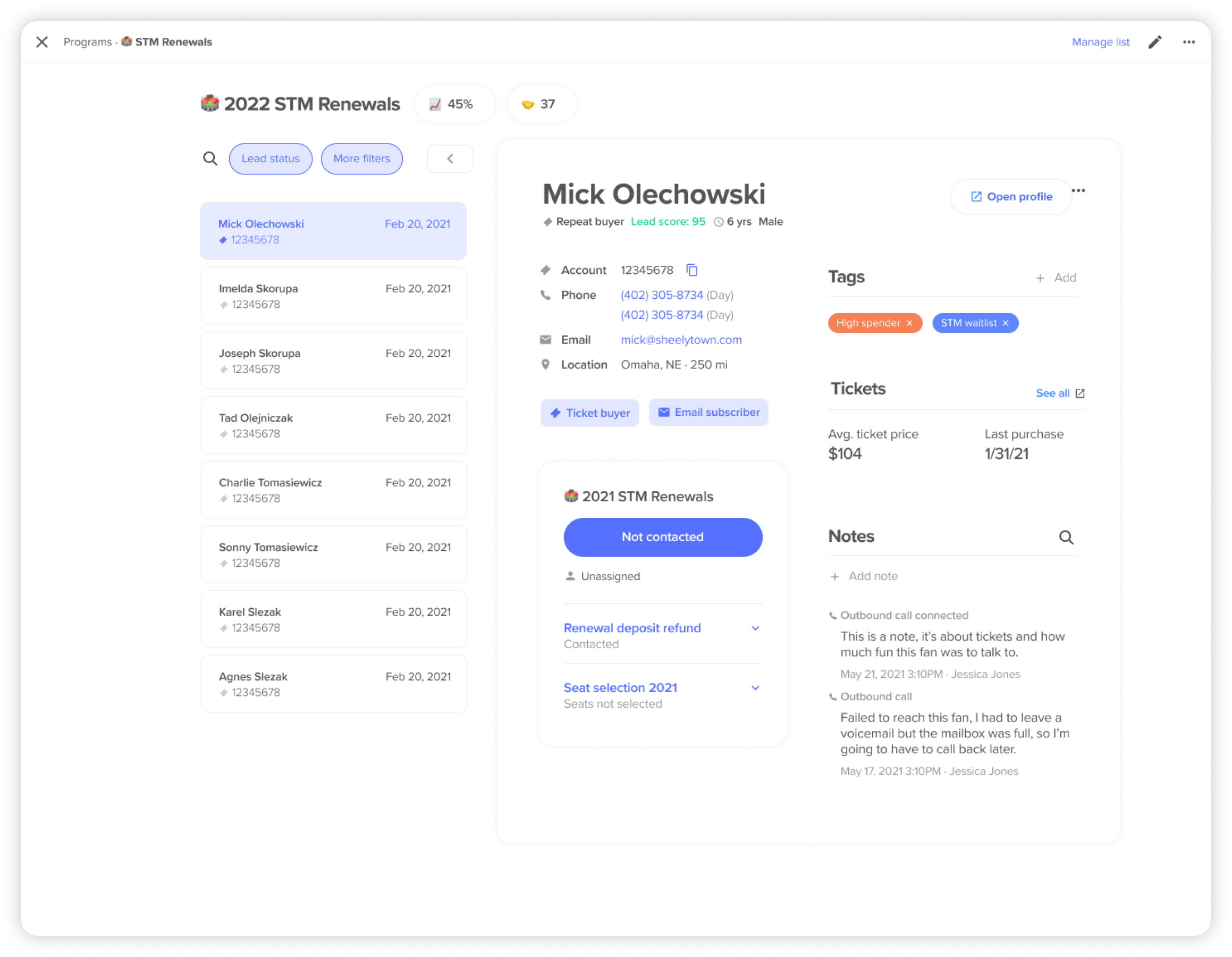 The redesigned fan list page from 2022
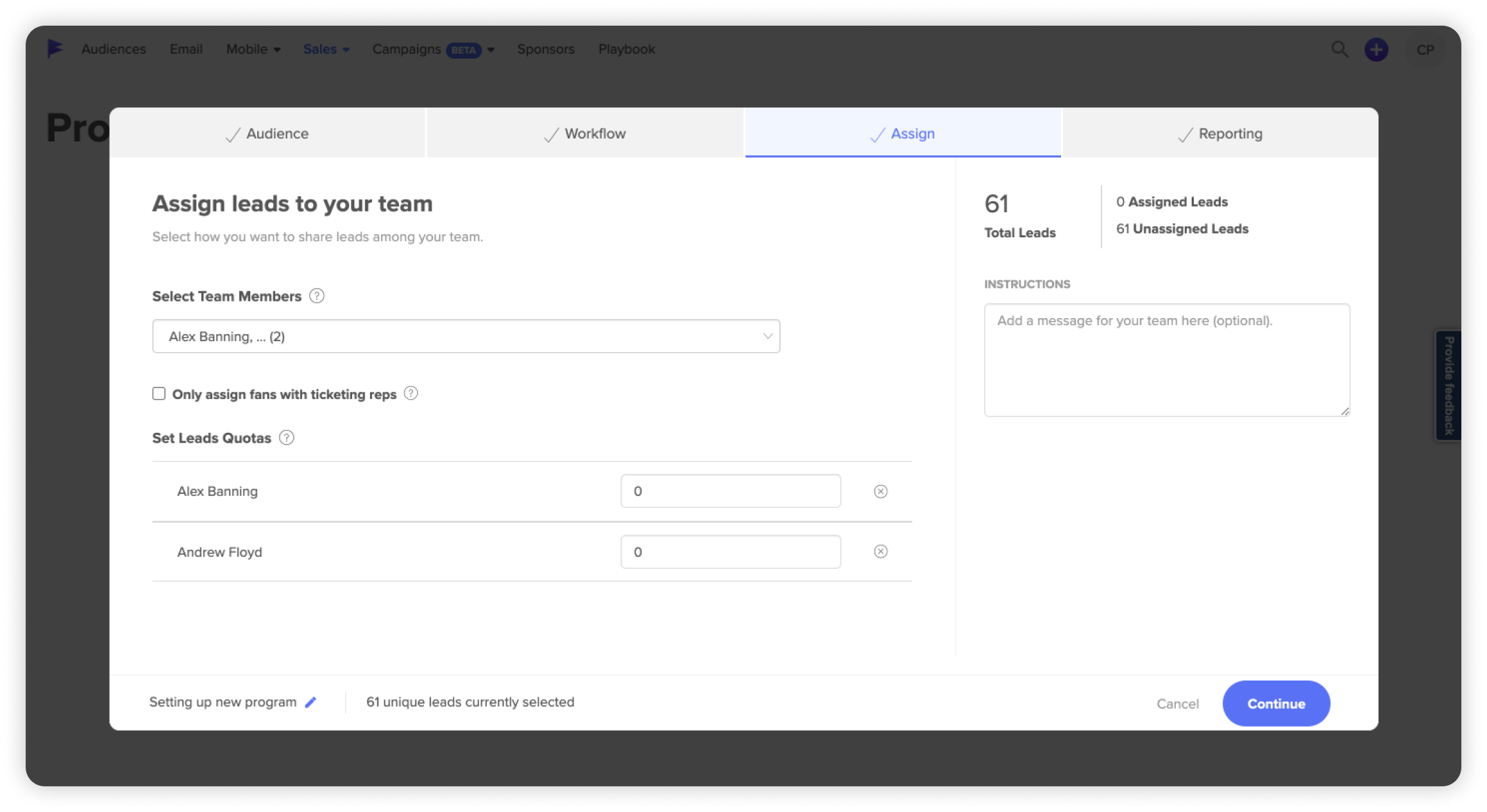
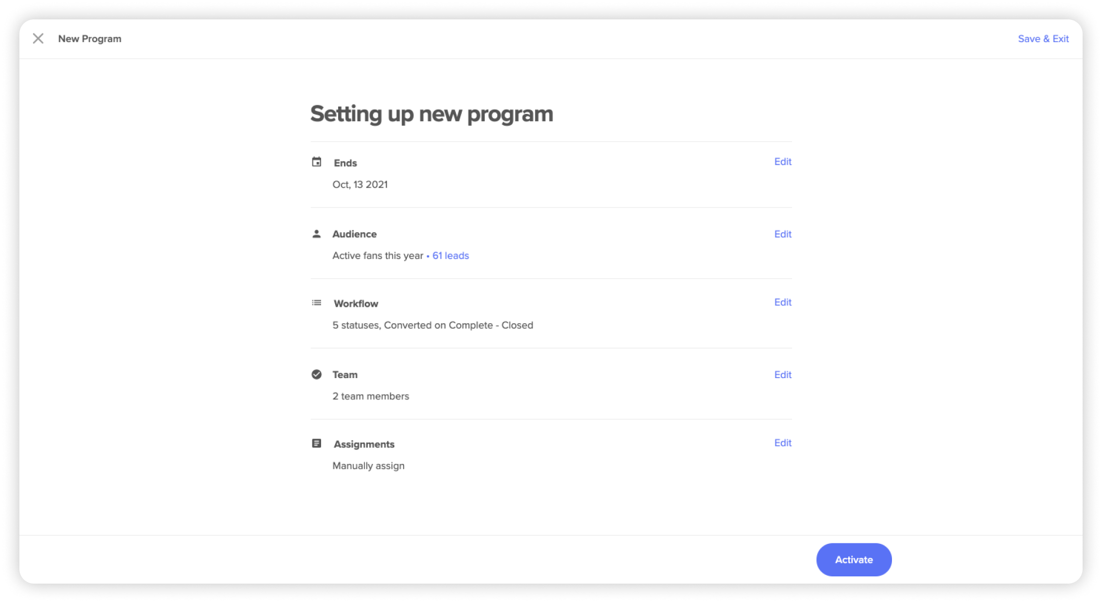
Creating a program
A sales manager has several decisions to make when setting up a program: which fans to target, how to assign fans to reps and what workflow statuses to include. The original builder tried to cram too many decisions onto one page and failed to make complicated business rules clear.
 Original version of the programs builder
In our new design system, we try to make creating things as easy as possible for our users by choosing smart defaults.
 Current programs builder
Modals help the user focus on one decision at a time. And instead of trying to sum up a whole set of business rules in a single phrase, we take the space we need to spell it out more explicitly.
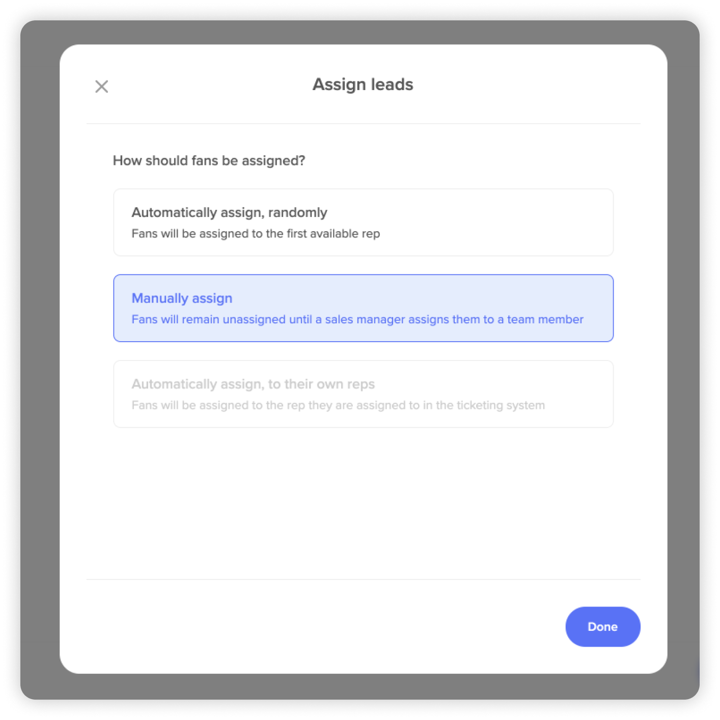 New copywriting spells the choices out